Start with the job the images need to do
A consistent series is more than a set of images made with the same prompt. Each image may show a different subject, but viewers should recognize a shared visual language. Before choosing colors or writing prompts, identify where the images will appear, who they are for and what they need to communicate. A series of article illustrations may need room for headlines, while a collection of character portraits may depend more on recognizable faces and clothing.
Write a short creative brief that names the audience, intended feeling and practical constraints. For example: “Friendly illustrations of everyday technology for a small-business guide; clear at thumbnail size; calm rather than futuristic; space for text on the left.” This brief becomes a decision tool. If an image is striking but too crowded for its intended use, it does not meet the brief.
Choose a small set of reference images that represent qualities you want to repeat. Describe those qualities in your own words rather than relying on a reference alone. References can help you evaluate composition and mood, but they do not guarantee that an image tool will reproduce them accurately or appropriately.
Define the visual rules that matter most
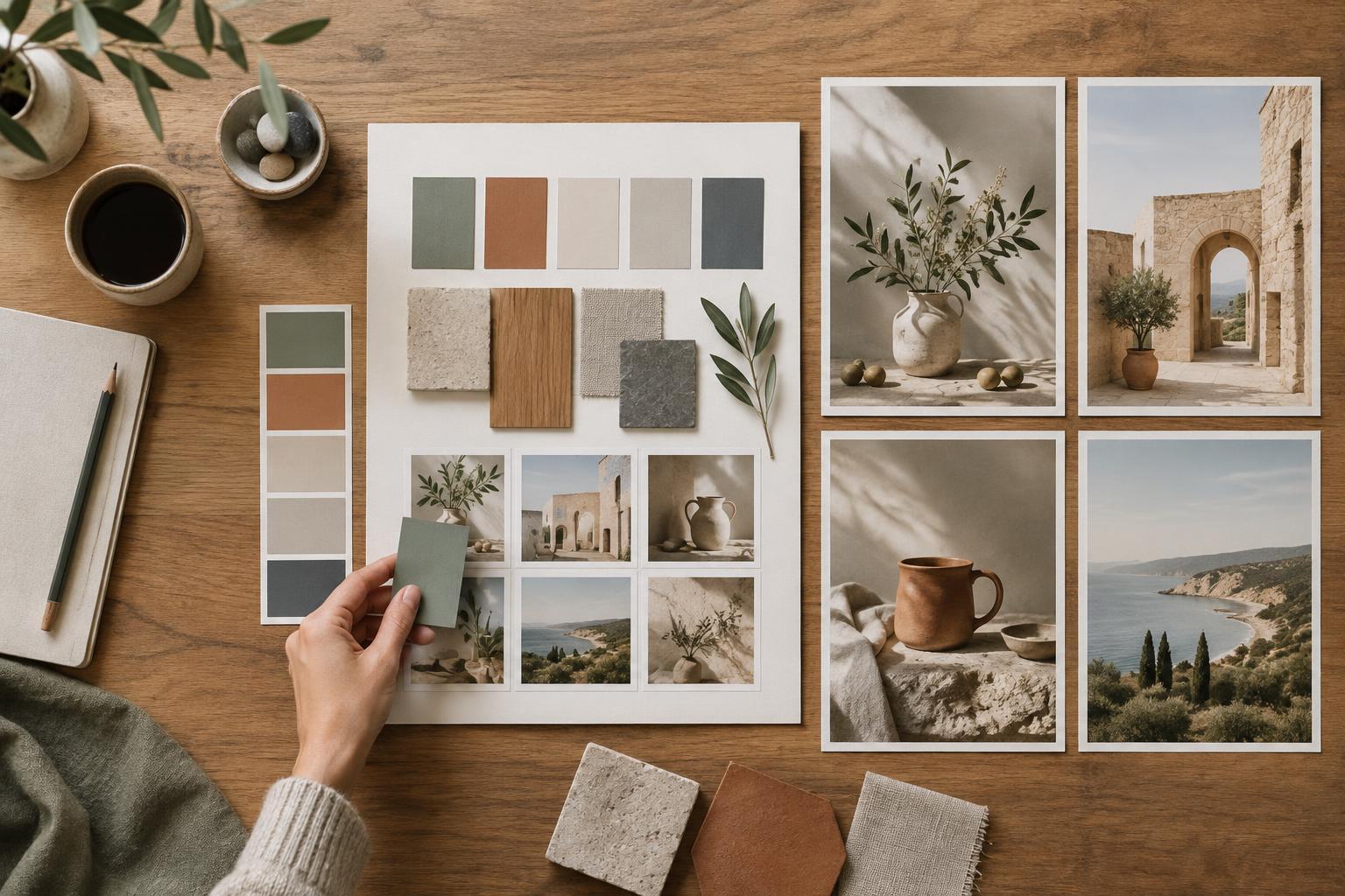
Your style guide should separate fixed rules from flexible choices. Fixed rules might include a limited palette, soft directional lighting, uncluttered backgrounds and a consistent amount of empty space. Flexible choices might include the subject, setting or camera angle. This distinction gives the series coherence without forcing every image into the same composition.
Record concrete decisions for color, composition, texture and level of detail. Instead of “modern and clean,” try “muted blue and warm cream as dominant colors, one small orange accent, simple shapes, little background detail.” Add rules for recurring elements if needed: a character’s defining features, a product’s proportions or the way shadows fall. If text must appear in the finished design, it is often easier to leave a clear area in the image and add the text during layout.
Include a short “avoid” list. It might rule out glossy surfaces, busy patterns, dramatic neon lighting or tiny decorative details that disappear at small sizes. Keep this list focused; too many restrictions can make the guide hard to use and the images visually stiff.
Turn the guide into a reusable prompt
Build a prompt template with two parts: a stable style description and a replaceable scene description. The stable part carries your palette, lighting, composition and texture rules. The scene part describes what changes from image to image. A working template could read: “Create an illustration of [subject and action] in [setting]. Use simple shapes, muted blue and warm cream with a small orange accent, soft daylight, minimal background detail and open space on the left. Keep the mood approachable and the main subject readable at small size.”
Be specific about relationships, not just objects. “A person examining a device at a desk, viewed from slightly above, with the device as the focal point” gives the tool more compositional direction than a list of nouns. If your image tool offers reference images, aspect-ratio controls or repeatable generation settings, document which ones you used. Their effects can vary between tools and versions, so treat saved settings as helpful starting points rather than a promise of identical results.
Keep a copy of the exact prompt used for each selected image. When you revise a prompt, change one or two elements at a time. That makes it easier to tell whether a new lighting instruction, palette rule or composition request improved the result.
Test the system across different subjects
A style guide is useful only if it works beyond one successful image. Test it with several distinct scenes, such as a close-up, a group scene and a setting without people. View the results side by side at the size they will actually be displayed. Ask whether the focal points are clear, the colors feel related and the images have enough variety to serve their individual purposes.
When a result misses the mark, diagnose the mismatch before generating more images. If backgrounds are too busy, strengthen the background rule. If every scene has the same framing, loosen the composition instruction while keeping the palette and texture stable. Image generation can vary even with similar inputs, so selecting, editing and occasionally remaking images are normal parts of the workflow.
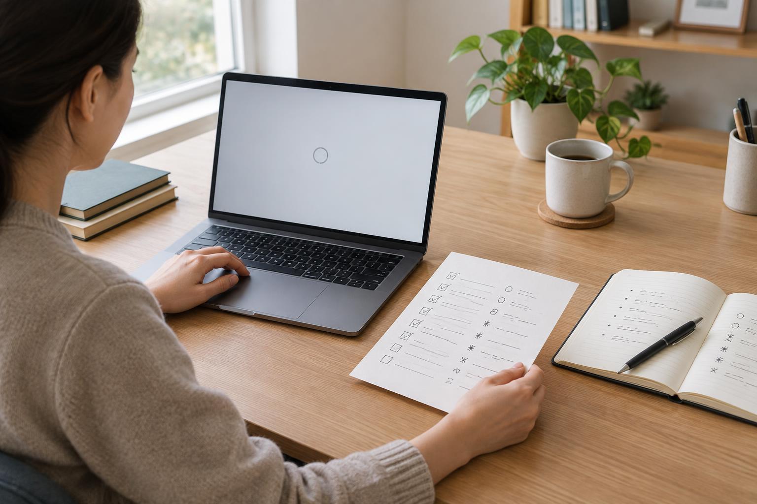
For recurring characters or objects, compare specific features across the series rather than judging overall resemblance alone. A brief checklist of distinctive shapes, colors and proportions can make review more reliable. AI-generated details may still drift; manual editing or using a consistent source asset may be preferable when exact continuity matters.
Save a guide the whole team can use
Package the final guide as a short working document: the creative brief, fixed and flexible rules, the prompt template, a few approved examples and examples of common failures. Label images with the scene description and any settings worth repeating. Someone joining the project should be able to produce a plausible new image without guessing which details are essential.
Review each finished image in its real context, not just in isolation. Check legibility, cropping, visual consistency and whether it accurately represents the intended subject. Also review tool terms and your own permissions before using references, brand elements or identifiable people. The guide should support thoughtful creative decisions, not replace them. Update it when repeated tests reveal a clearer rule or when the series needs a deliberate change of direction.