Why lettering needs its own workflow
An AI-generated poster may look polished at a glance while its headline contains invented characters, uneven spacing or words that dissolve into the background. An image model can produce the appearance of lettering without reliably placing every requested character. That makes it useful for exploring a visual direction, but less dependable for text that must be read exactly.
The practical fix is to treat image creation and typesetting as separate jobs. Use the image generator for the scene, illustration or texture. Then place the headline, labels, date or call to action as editable text in a layout tool. This approach gives you direct control over spelling, type size, alignment and contrast. It also lets you revise the copy without generating the entire image again.
Plan space for the words before generating
Start with the message, not the image prompt. Write the exact text the finished graphic needs, decide which line matters most and note the intended format. A square social graphic, a wide presentation slide and a tall flyer leave different amounts of room for a headline. Shortening a headline before you design is usually easier than forcing a long sentence into a crowded composition.
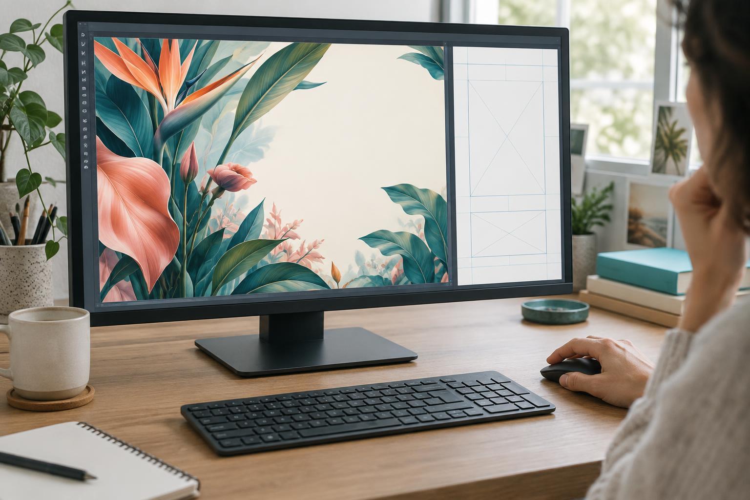
Next, choose a text zone. You might reserve the upper third for a headline, keep one side of the image quiet for a caption or use a solid panel beneath the illustration. Ask the image generator for a composition with clear negative space in that area. You can also request no letters, words, logos or signage. That request may not prevent every stray mark, so inspect the result before using it.
Keep essential subjects away from the planned text zone. If the best image puts a face, product or intricate pattern behind the headline, try a different composition or crop. A relatively calm background makes the later layout step faster and the final message easier to read.
Create the visual, then build the layout
Generate a few visual options and select one for composition rather than for any text it happens to contain. Check for accidental lettering on signs, clothing and objects, especially where it could be mistaken for your intended message. If unwanted marks are prominent, regenerate, crop or use an appropriate editing tool to remove them. Keep the original image file so you can return to it if a later edit causes problems.
Import the chosen image into a design or presentation tool and add each piece of copy as a text element. Choose a typeface that fits the project, but prioritize legibility over novelty. Establish a clear hierarchy: the headline should be easiest to notice, while supporting details should remain readable without competing with it. Use consistent margins and align text to a small number of guides rather than positioning each line by eye.
If the background is busy, improve contrast with a restrained overlay, a solid text panel or a subtle change in text placement. Avoid relying on effects that make letters look impressive at full size but muddy when the graphic is reduced. Keeping the words editable also makes it simpler to prepare a second size or correct a late change.
Check the finished graphic where people will see it
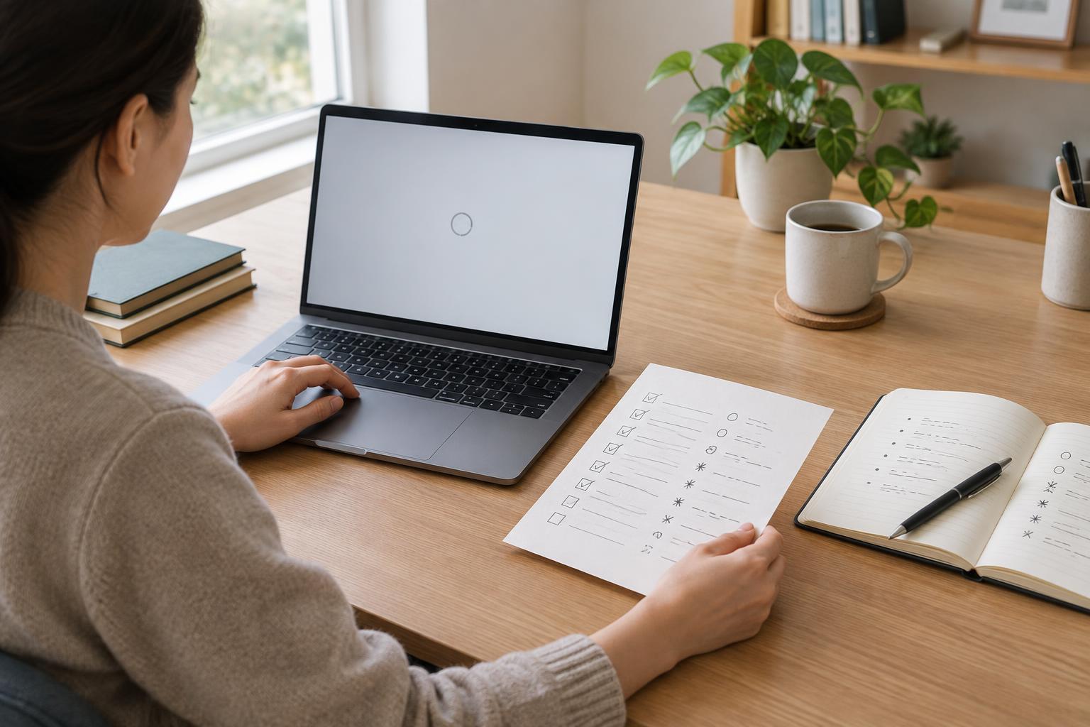
Proofread the text in the layout, not just in your original notes. Look for missing words, punctuation changes, awkward line breaks and details that may have been copied incorrectly. If the graphic includes names or other information supplied by someone else, confirm the final wording against the material they provided.
Then view the export at a realistic display size. A headline that reads well on a large editing canvas may become cramped in a thumbnail or on a phone. Check whether the text stays within safe margins and whether the main message can be understood without zooming. If not, simplify the copy, enlarge the important line or give it more visual space.
Finally, inspect the exported file itself. Confirm that the correct version was saved, the crop is intentional and no stray AI-generated lettering remains. Save the editable layout alongside the export; it is the version you will need when the copy, size or visual direction changes.
When to let generated text remain in the image
Not every mark that resembles writing needs to be removed. Indistinct lettering on a distant object may work as background texture when no one is expected to read it. The distinction is whether the words carry information. For a title, label, instruction or brand name, add deliberate text in the layout step rather than trusting generated pixels.
This division of work does not require an elaborate production process. A written message, an image with room for it, a few editable text elements and a careful export check are enough for many small projects. Let the AI image provide the visual atmosphere; let the layout carry the exact words.